Summary
The Cheyenne Mountain Zoo’s ticketing experience required a structural and visual redesign. The existing flow involved numerous steps, unclear navigation, and an inconsistent presentation of information. My redesign focused on simplifying the purchase process, clarifying navigation patterns, and eliminating unnecessary redirections and pop-ups.
My Role
I served as the sole designer and researcher for this project. I conducted usability testing, analyzed user pain points, defined the problem space, created task flows, and developed low-, mid-, and high-fidelity prototypes.
The Challenge
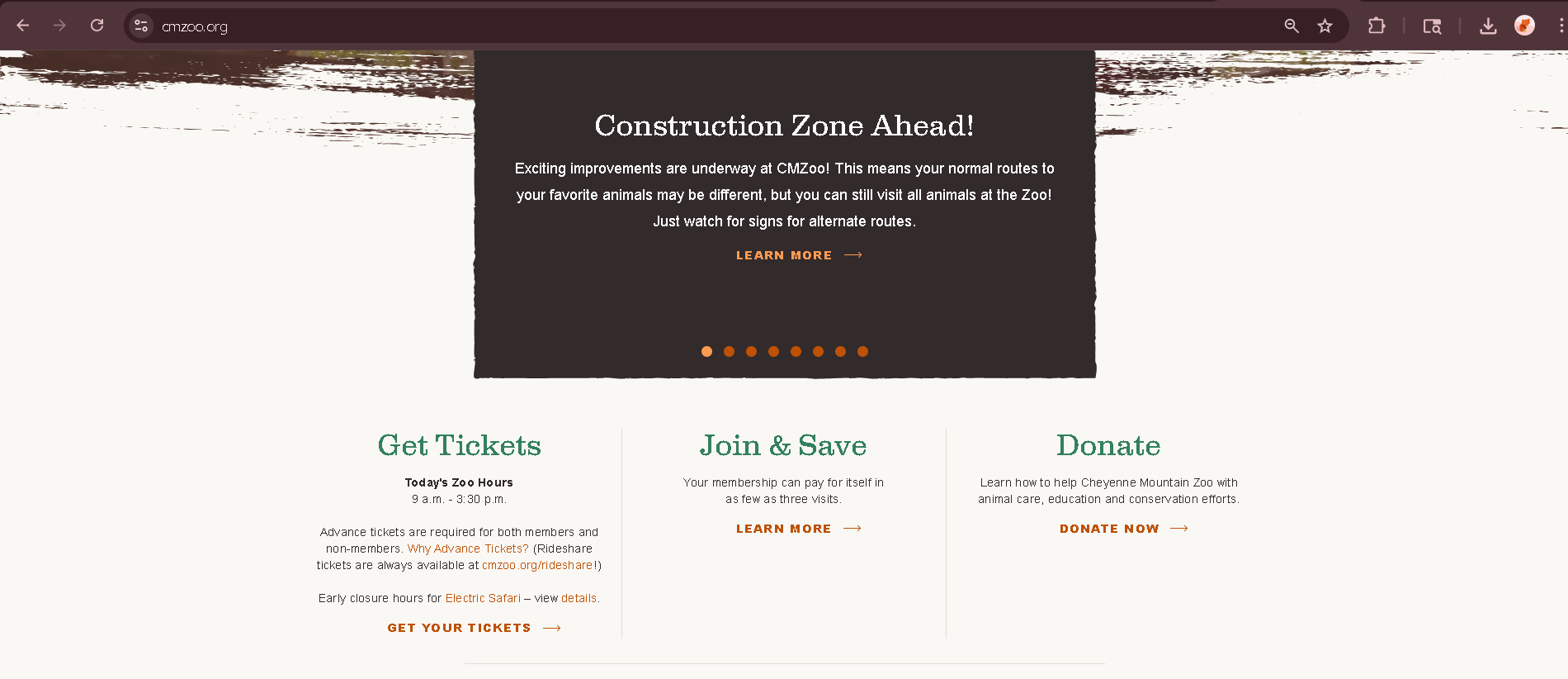
The zoo’s original ticketing flow was visually inconsistent, overwhelming, and required excessive navigation steps. The interface contained dense text, unclear hierarchy, and multiple redirects to third-party systems. I also needed to re-familiarize myself with Figma after a significant break.
Research
Usability Testing & Initial Pain Points
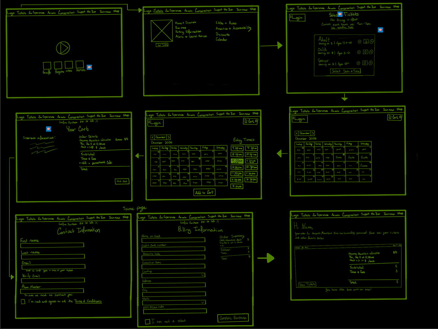
Early usability testing revealed a major issue: the ticket-purchasing flow was overly complex, requiring users to click through nine buttons, four separate screens, two pop-ups, and a third-party checkout before completing a purchase. Participants also noted that information was difficult to locate and that the layout lacked a clear visual hierarchy.
These findings led to the guiding question: “How might we create a simpler and more intuitive ticketing flow that aligns with user expectations?”
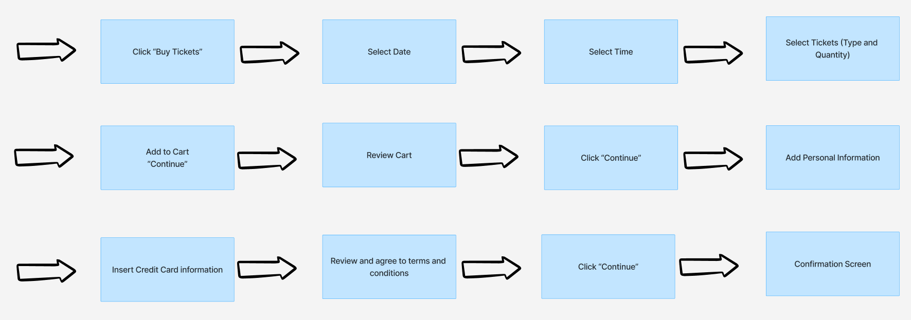
In response, I redesigned the flow to reduce steps, remove pop-ups, avoid external redirects, and ensure that all essential actions could be completed within five consolidated screens.
The redesigned process reduces the full ticketing interaction to five screens, eliminates redirects, removes pop-ups, and decreases button interactions from nine to seven.
Design
Problem Statement
Visitors to the Cheyenne Mountain Zoo need an easy, streamlined way to purchase tickets online because the current website is overwhelming, text-heavy, and confusing, making it difficult to quickly plan and complete a purchase.
Task Flow
I aimed to design a ticketing process with fewer steps, fewer clicks, and no redirections. Inspired by modern movie-ticketing flows such as AMC, I structured a predictable user path from ticket selection to checkout. This direction reflected feedback from the initial user study, where participants expressed a preference for familiar and direct ticketing patterns.
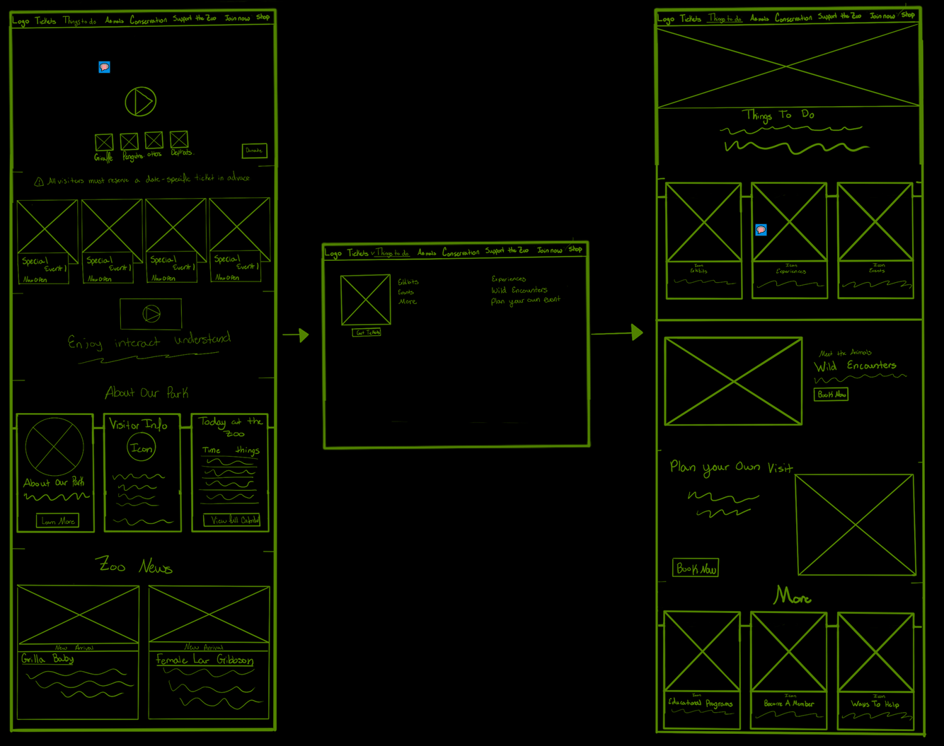
Low-Fidelity Wireframes
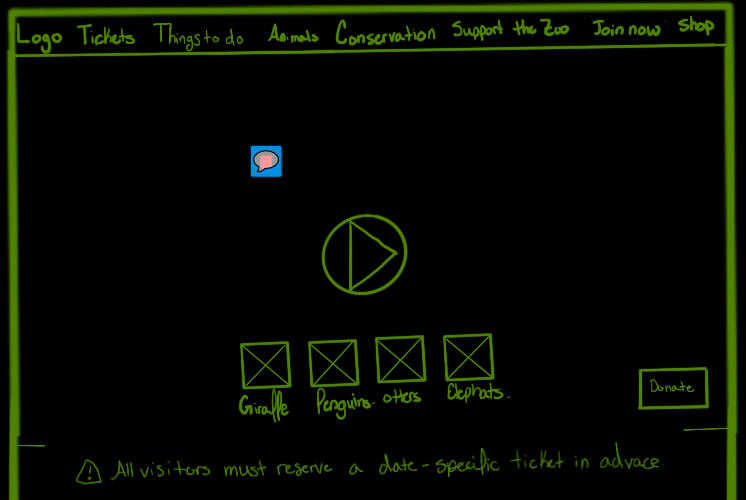
Low Fidelity — Homepage Hero
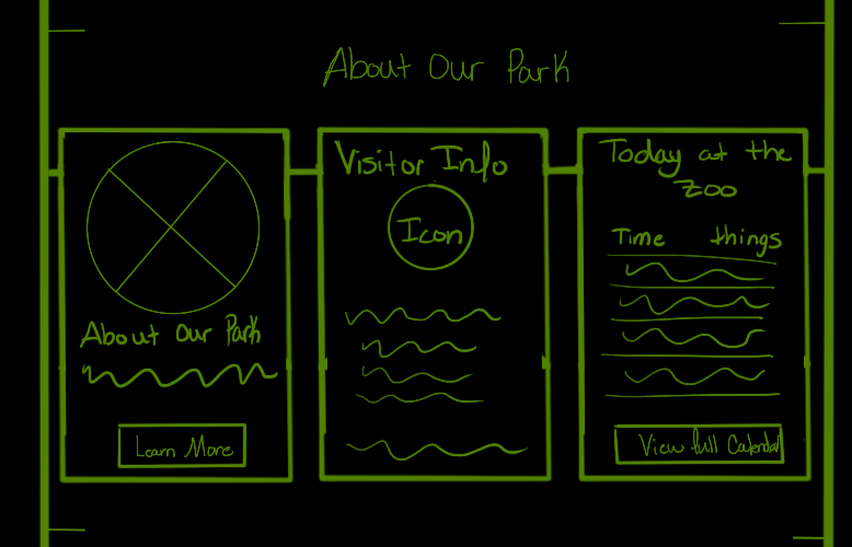
Low Fidelity — Card Layout
Low Fidelity — Ticket Quantity
Low Fidelity — Date & Time
Low Fidelity — Billing
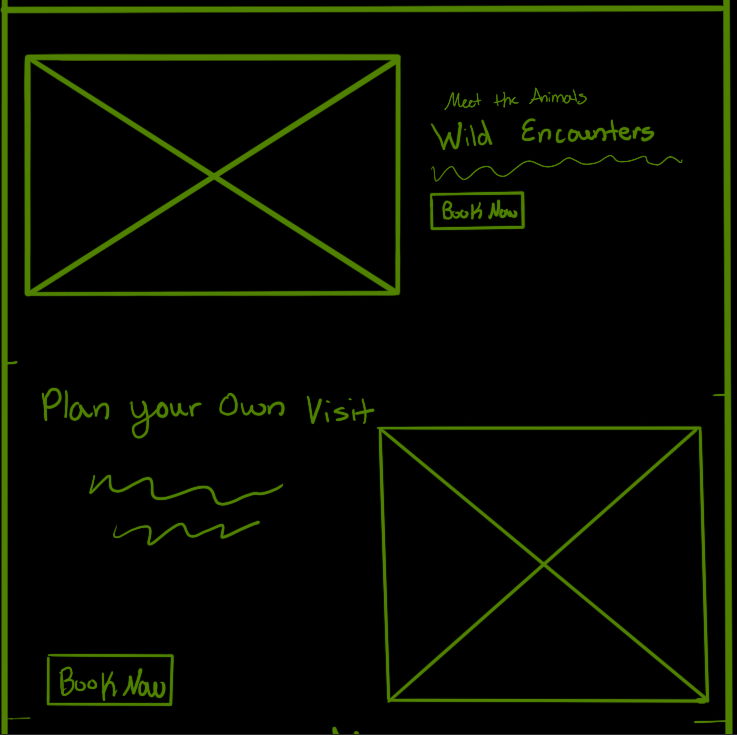
Low Fidelity — Wild Encounters
The low-fidelity wireframes were informed by an analysis of AMC’s ticket flow and the Bronx Zoo’s ticketing experience. I borrowed structural patterns that supported clarity and speed while preserving Cheyenne Mountain Zoo’s strengths, such as strong imagery and video content. Dense paragraphs of text were replaced with a cleaner, image-supported layout.
Mid-Fidelity Wireframes
Mid Fidelity — Homepage Hero

Mid Fidelity — Card Layout
Mid Fidelity — Ticket Quantity
Mid Fidelity — Date & Time
Mid Fidelity — Billing
Mid Fidelity — Wild Encounters
During the mid-fidelity phase, I refined spacing, corrected grid alignment issues, and introduced important interaction details and state changes for selected versus unselected options. These updates made the flow more realistic, while exposing some opportunities to clarify content hierarchy.
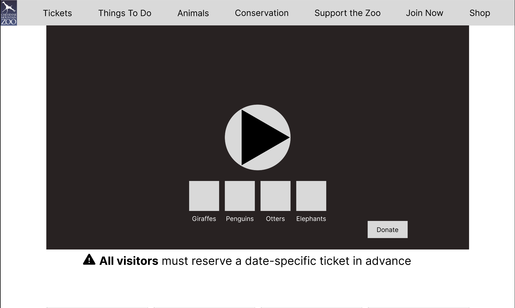
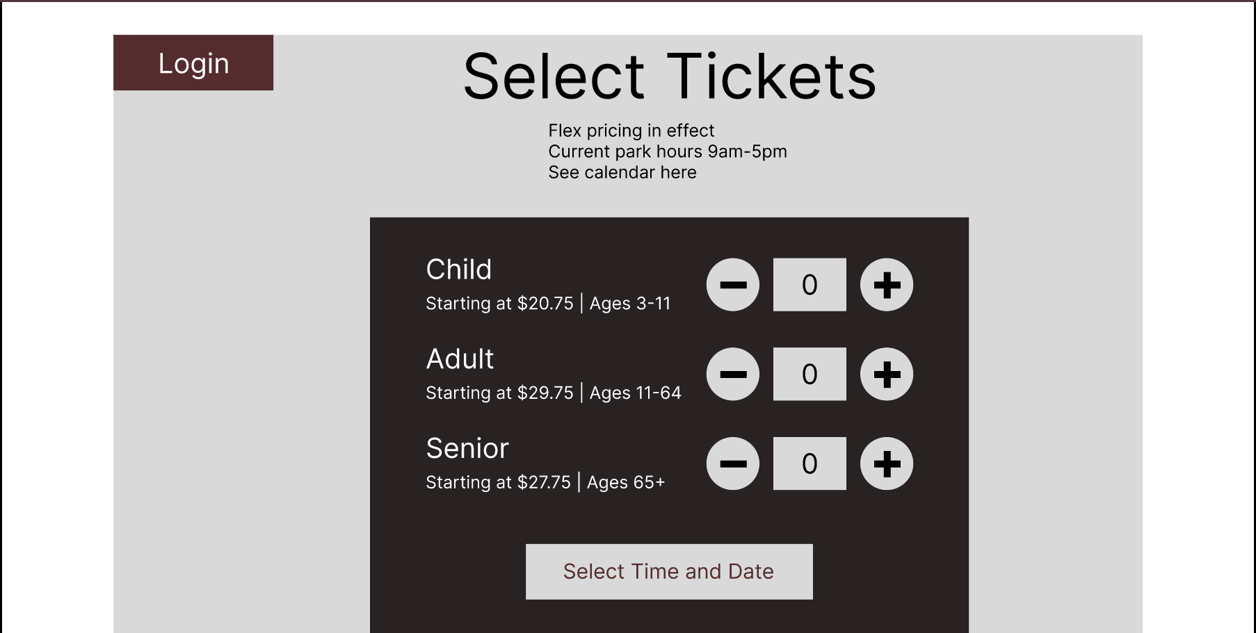
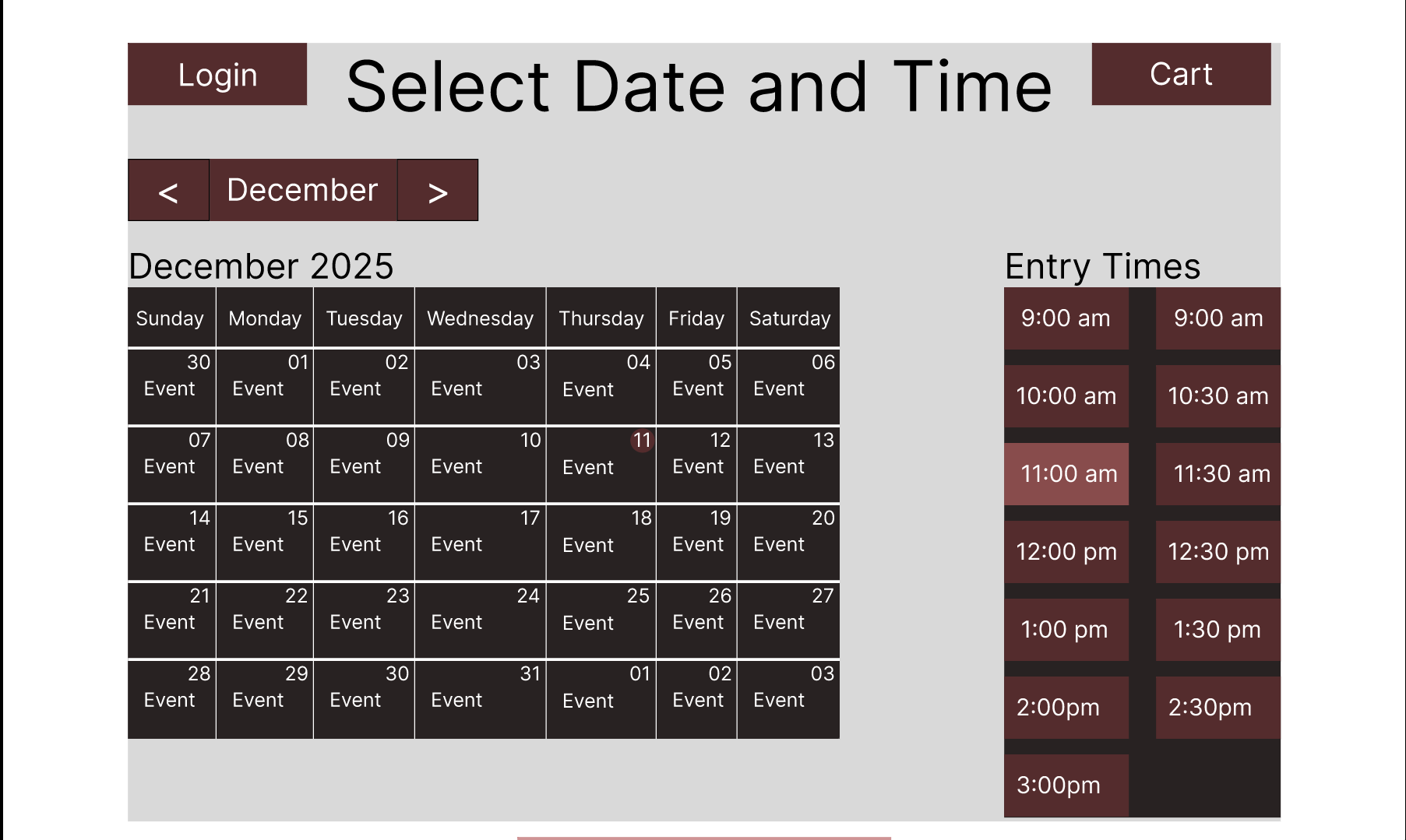
High-Fidelity Wireframes
Cheyenne Mountain Zoo – Hero Video
Immersive preview of the redesigned homepage experience.
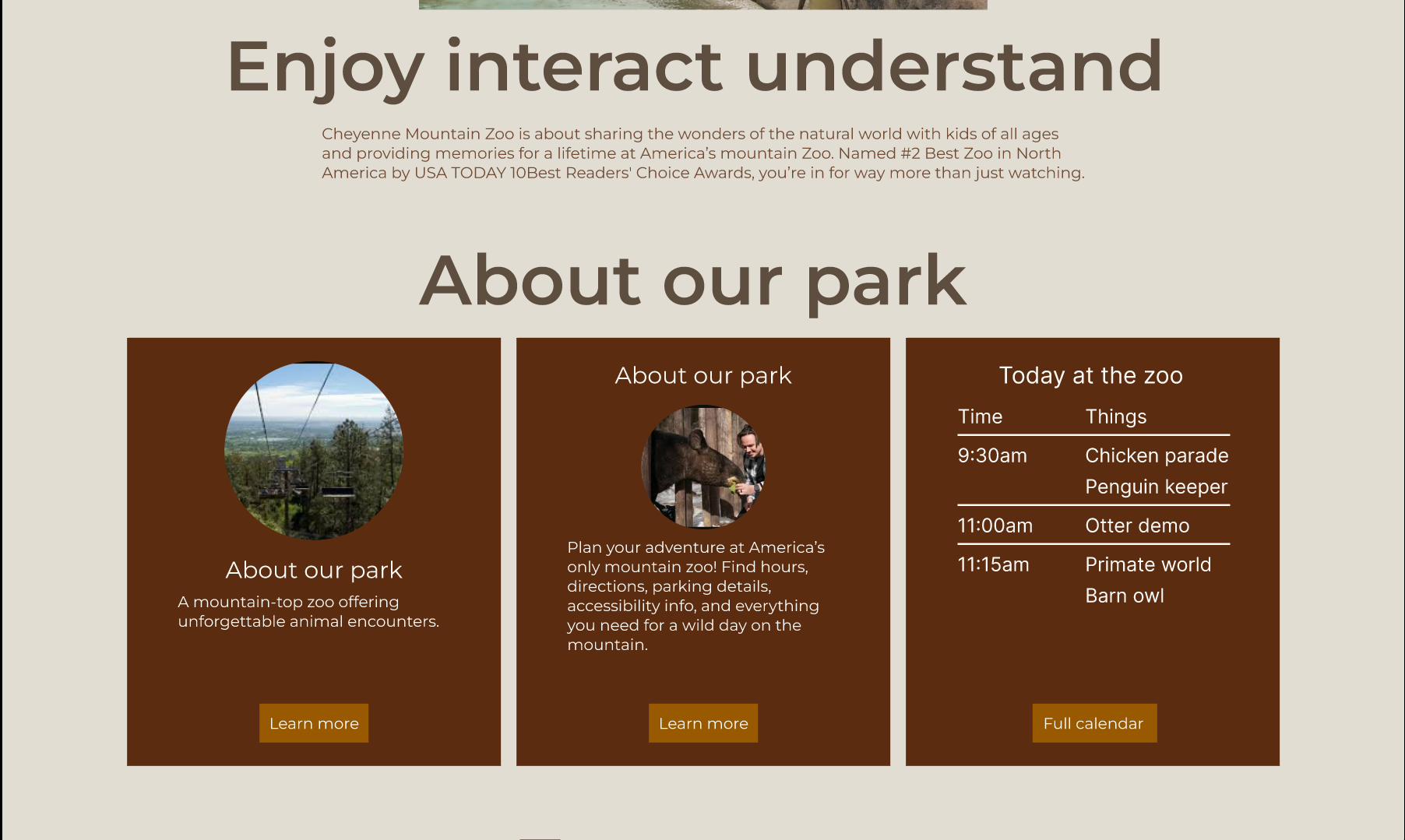
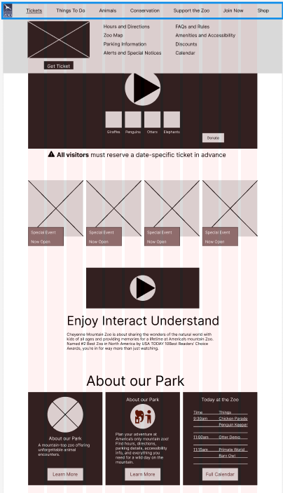
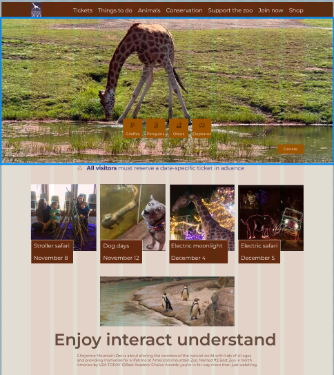
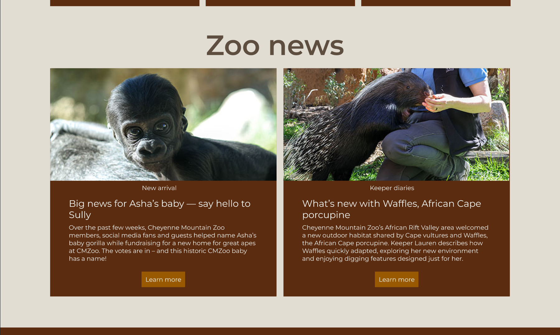
High Fidelity — Homepage & Cards
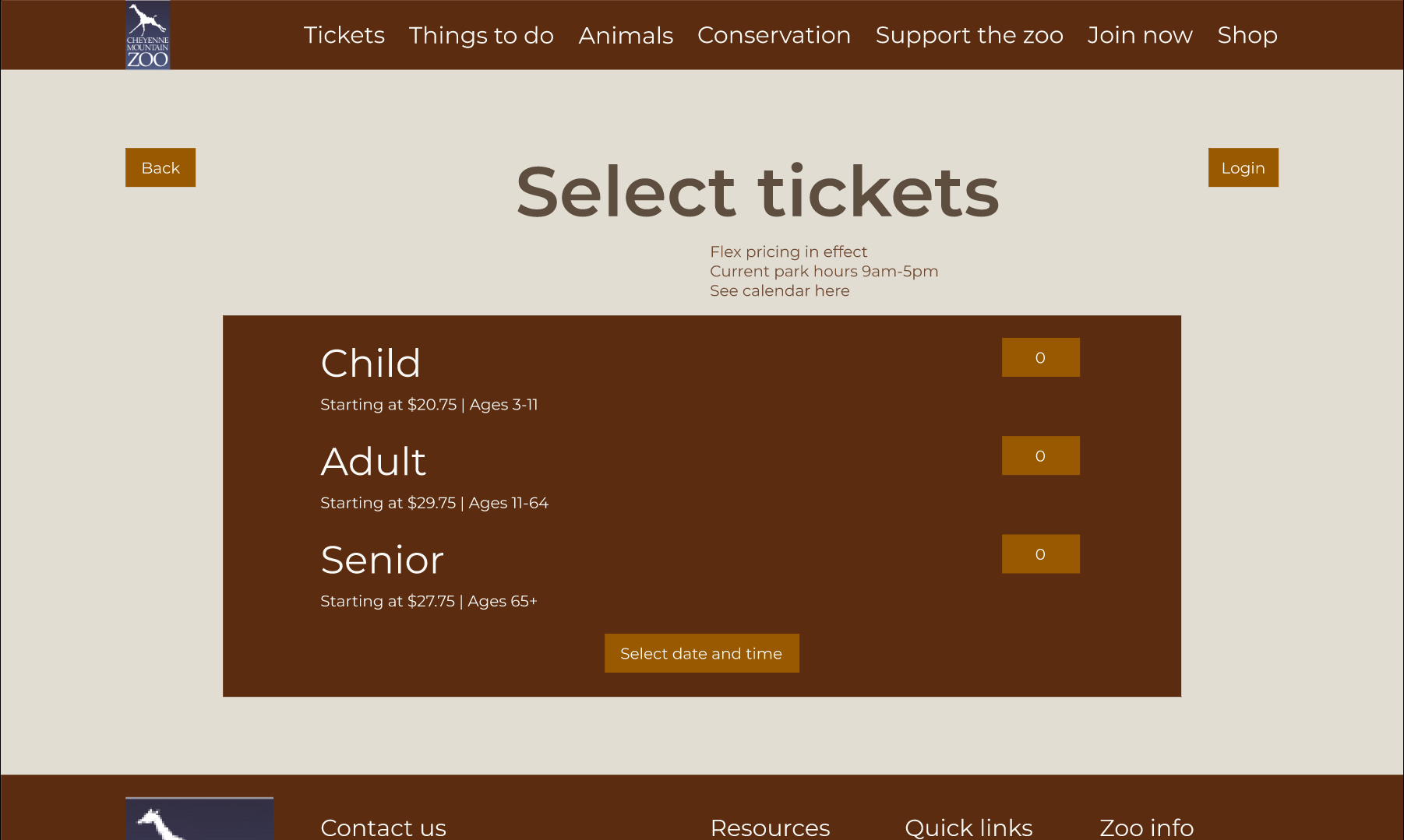
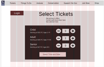
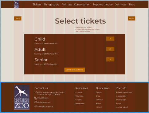
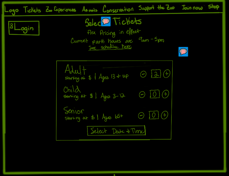
High Fidelity — Ticket Selection
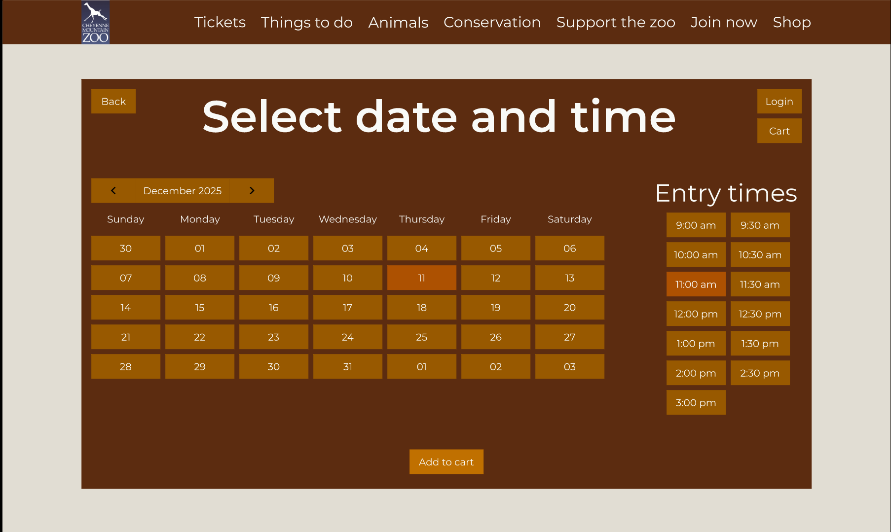
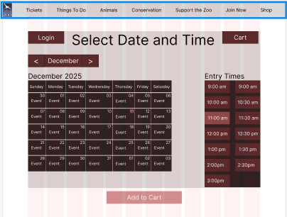
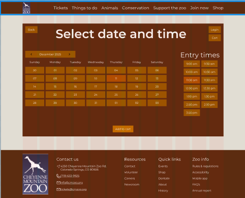
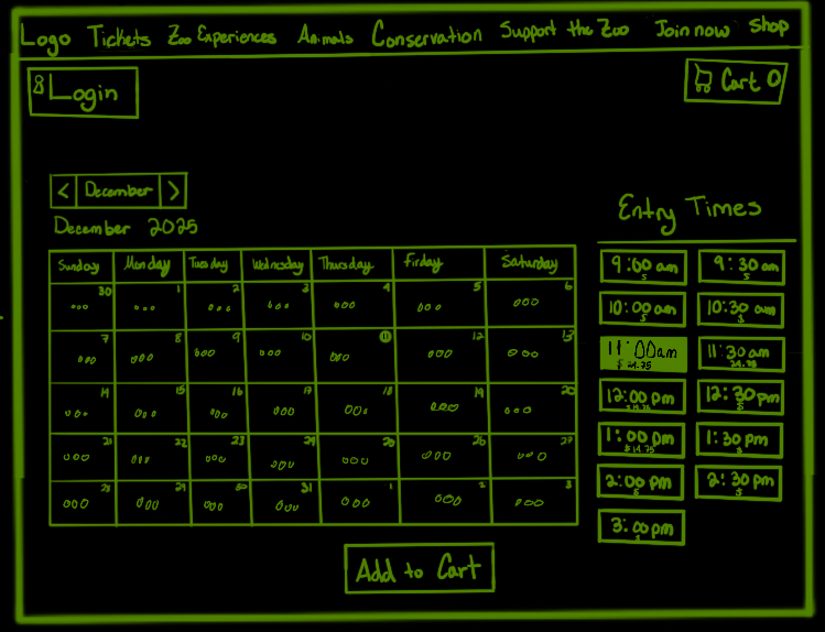
High Fidelity — Date & Time
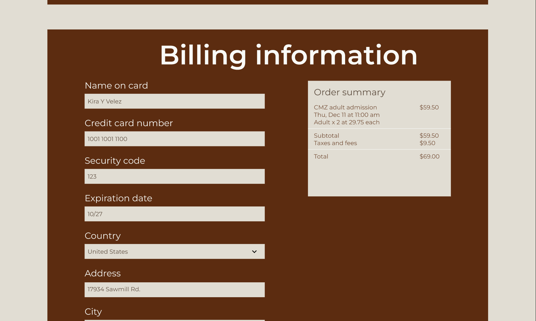
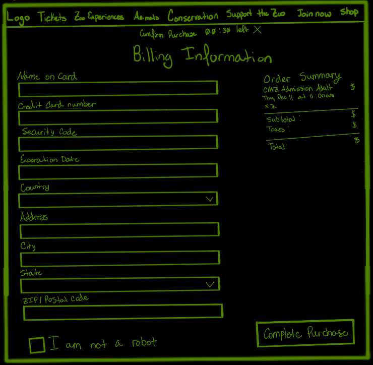
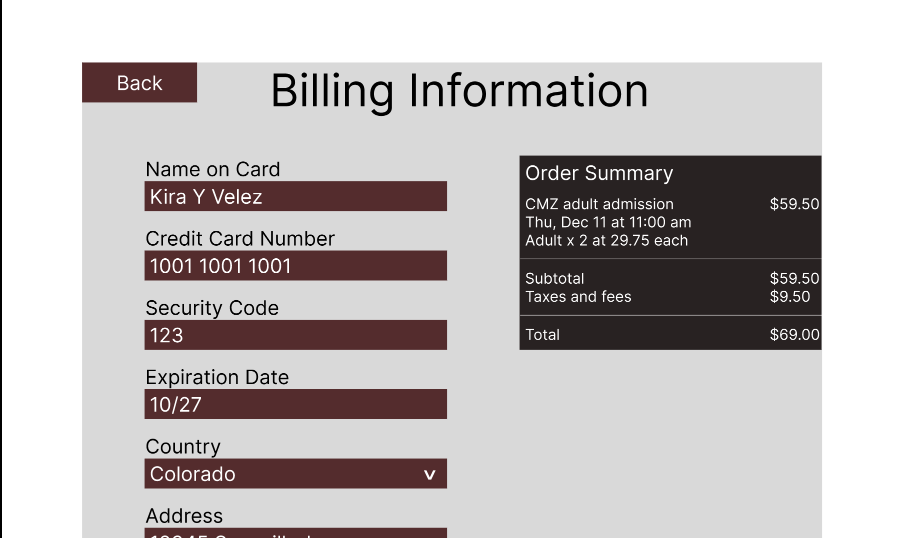
High Fidelity — Billing
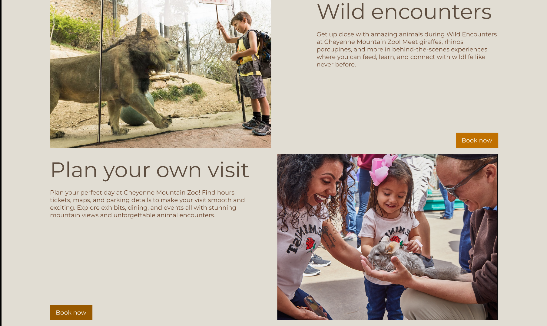
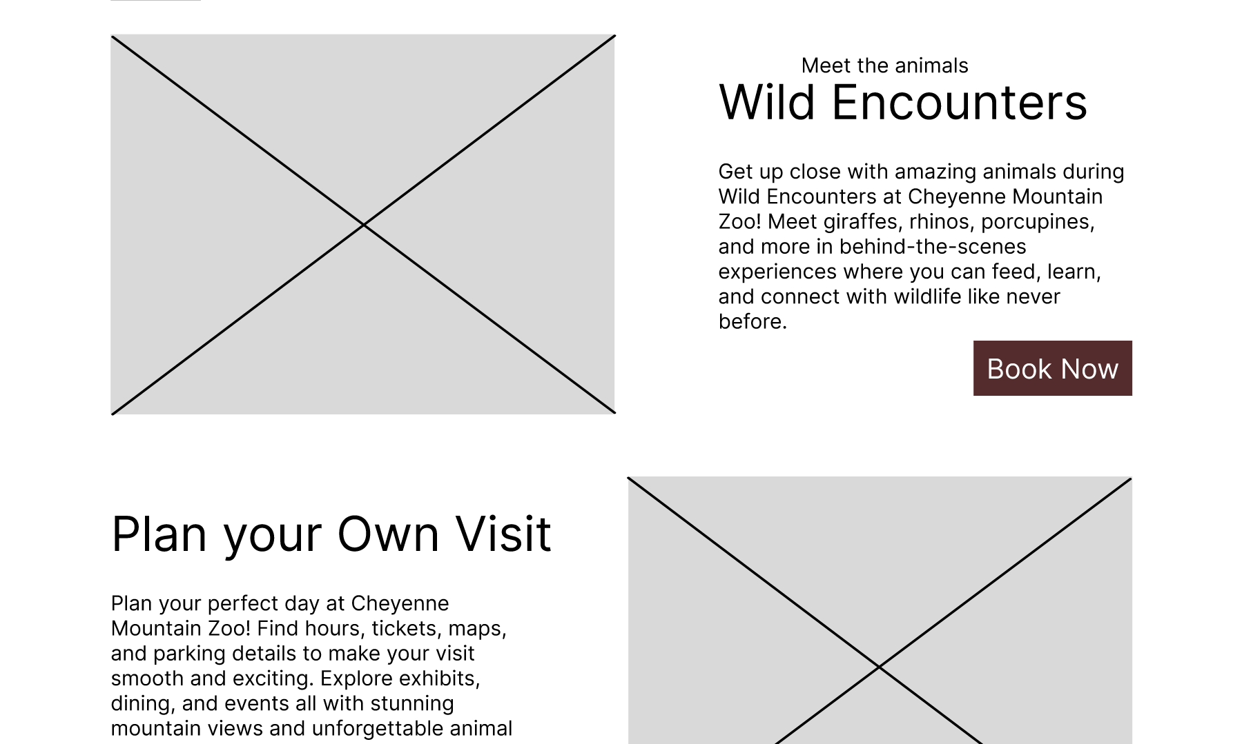
High Fidelity — Wild Encounters
In the high-fidelity phase, I introduced final imagery, refined the color palette to meet WCAG AA contrast standards, and improved spacing for legibility. I also removed unnecessary boxy elements and replaced quantity controls with more intuitive actions. Feedback from users directly informed these redesign measures including the visual refinements.
High-Fidelity Interactive Prototype
The final prototype combines a clearer information hierarchy, accessible color usage, and a more focused interaction model. Back buttons, descriptive labels, and consistent button styles support a predictable experience, while imagery and video content preserve the zoo’s personality.
View Interactive PrototypeInstructor Feedback
Instructor feedback focused on structural and formatting inconsistencies across the wireframes, including grid misalignment, capitalization patterns, and unclear button hierarchy. We also discussed contrast requirements, the role of icons, and when to simplify or remove decorative containers.
In response, I refined the color system to meet AA contrast guidelines, defined primary and secondary button styles, reduced unnecessary framing, and corrected layout inconsistencies. These changes improved both accessibility and the overall polish of the interface.
Evaluation and results
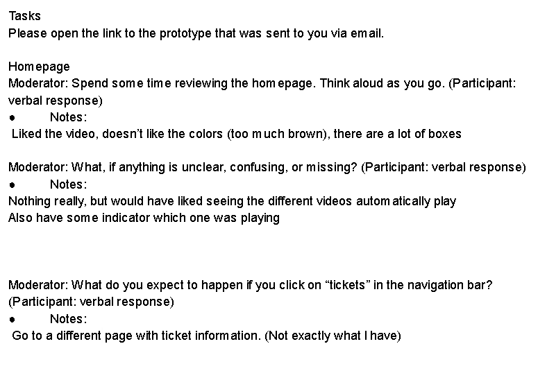
User testing process and & Pain Points
I conducted usability testing with three participants using the updated high-fidelity prototype. Their feedback revealed several areas needing improvement. The most consistent concern involved visual clarity. Users noted that the original color palette was too dark, resulting in poor contrast and reduced readability, especially for smaller text elements. Participants also identified interaction inconsistencies, including squished or unclear buttons, oversized icons, and navigation that required clicking instead of intuitive hover behavior. Layout concerns were also observed, such as misaligned content, overly dense boxed sections, and compressed calendar elements that made information harder to interpret. Additionally, multiple users expected a dedicated “Tickets” information page and were confused by its absence.
Updates Made Based on User Feedback
Based on these findings, I implemented some improvements to strengthen the visual hierarchy and usability of the final design. I refined the color palette to increase contrast and ensure WCAG-compliant accessibility, updated the alignment and spacing of key components, and removed unnecessary box elements to reduce visual clutter. I also standardized button styles, improved the clarity of the “Get Tickets” call-to-action, and adjusted icon sizes for better consistency across screens.
While time constraints prevented me from adding the requested dedicated ticket-information page or updating the video-player interactions, these remain important opportunities for future redesign efforts. The completed updates significantly improved readability, interaction clarity, and overall cohesiveness in the final prototype.
Reflection
Future Plans
If I had additional time, I would expand the experience with a dedicated ticket information page that explains pricing options, membership benefits, and what guests receive when purchasing tickets in advance. I would also design fully responsive mobile layouts, since many visitors are likely to buy tickets on their phones while planning a visit. Further usability testing with a broader and more diverse group of participants would help validate the updated flow and uncover edge cases such as group bookings, accessibility needs, and last-minute purchases.
Conclusion
This project reinforced how strongly visual hierarchy, and interaction design influence a user’s confidence in completing a task. By simplifying the flow, clarifying navigation, and applying consistent visual patterns, the redesigned reduces cognitive load for visitors purchasing tickets. Working through several fidelity levels, combined with structured usability testing, helped me identify and address subtle issues that were not obvious in the initial wireframe.
The work also deepened my understanding of accessibility and design systems. Overall, this case study strengthened my skills in end-to-end UX design from research and problem definition through to prototyping, evaluation, and reflection.